Eliminating training for Salesforce
I identified a common component that was poorly implemented in Salesforce that could be improved alongside a larger initiative at a financial services company. Through a simple heuristic analysis, I identified usability concerns related to legibility and misclicks.
Fixing this component has resulted in the most universal praise I've received from the advisor community. This is the type of issue that's common at many companies, where something was implemented to achieve a deadline with some known limitations that didn’t get addressed after the initial release. These are the issues that compound and cause distrust from clients over time and are important to address.
The problem
At first glance, I thought updating this component would be very easy, but this element intersects across different levels of advisors, assistants and multiple internal departments. The company provides training for advisors but not assistants, which increases costs for the advisors’ businesses. It was critical that the new design be more intuitive and easier to use for new advisors and assistants.
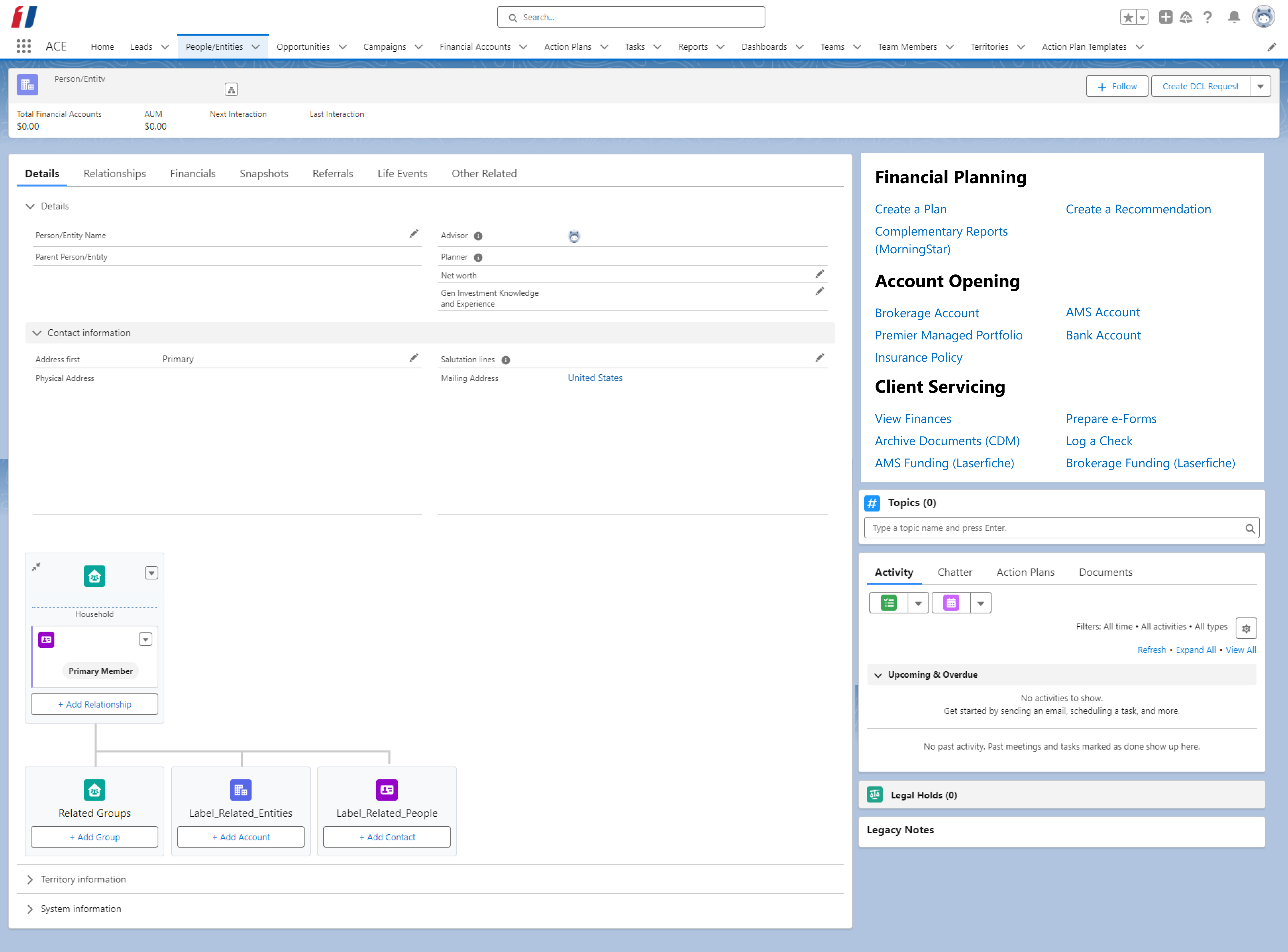
Original version

The company recently migrated to Salesforce for its CRM tool. However, based on internal direction from the home office, they prioritized speed for the migration with a ‘lift and shift’ approach. I conducted interviews with numerous junior and senior advisors to better understand the purpose of the links and how they are typically referred.
Updated version
Feedback from financial advisors and the training department helped me align the copy to how advisors talk about their services. Updating the copy and using simple design heuristics resulted in increased legibility, less misclicks, and improved findability.